
Responsive Design Principles for Solo SaaS Development
 by Shanie Goodwin
Explore the core principles of responsive design and their role in building adaptable SaaS applications. This guide offers practical steps and examples for solo developers to create user-friendly interfaces that work across devices, enhancing accessibility and performance.
Responsive design forms the foundation of modern web applications, especially in SaaS environments where users access services from various devices. For solo developers, adopting these principles ensures applications remain effective and user-friendly.
Why Responsive Design Matters in SaaS
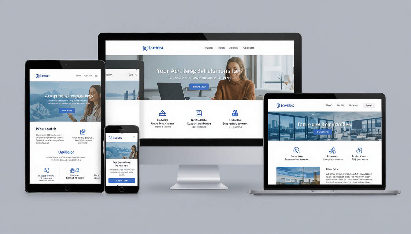
In SaaS development, creating interfaces that adapt to different screen sizes is essential. This approach allows solo entrepreneurs to reach a broader audience without building separate versions for desktops, tablets, and mobiles. For instance, a solo developer building a project management tool can use responsive design to maintain consistent user experiences.
Key to this is ensuring that layouts adjust dynamically. Elements like navigation menus and content blocks should rearrange based on the device's viewport. A real-world example is a freelance invoicing app that shifts from a multi-column layout on desktops to a single-column view on phones, improving readability.
Core Principles of Responsive Design
There are several fundamental principles that guide responsive design implementation. First, focus on fluid grids. These use relative units like percentages instead of fixed pixels, allowing elements to scale proportionally.
Another principle involves flexible images and media. By setting images to resize based on the container size, developers prevent overflow and distortion. For SaaS apps, this means logos and graphics in dashboards adapt without losing quality.
Media queries play a crucial role as well. These CSS techniques apply styles based on device characteristics, such as width or orientation. In a solo SaaS project, a developer might use media queries to hide non-essential elements on smaller screens, prioritizing core features.
Practical Advice for Implementation
For solo developers, starting with a mobile-first strategy can simplify the process. This means designing for the smallest screens first and then adding enhancements for larger ones. Begin by sketching wireframes that emphasize essential functions.
Use tools like CSS frameworks to speed up development. For example, frameworks provide pre-built components that handle responsiveness automatically. In a SaaS context, this saves time for entrepreneurs managing everything alone.
Testing is vital. Regularly check your application on different devices or emulators to identify issues. A step-by-step guide includes:
- Define breakpoints based on common device sizes.
- Apply fluid layouts using CSS flexbox or grid systems.
- Optimize images with responsive attributes to reduce load times.
- Ensure interactive elements like buttons remain accessible.
Real-World Examples in SaaS
Consider a solo-developed CRM system. Without responsive design, users on mobile devices might struggle with cluttered interfaces. By applying these principles, the developer restructured the layout so contact lists stack vertically on phones, making it easier to scroll and interact.
Another example is an e-commerce SaaS platform for small businesses. Here, product galleries adjust to show fewer items on smaller screens, maintaining performance and user satisfaction. These cases show how responsive techniques lead to better retention and feedback.
Step-by-Step Guide to Building Responsively
To implement responsive design in your SaaS project, follow these steps:
- Set up your HTML structure with semantic elements for better scalability.
- Write CSS that incorporates relative units and flexible boxes.
- Add media queries to handle different breakpoints, such as targeting screens below 600px.
- Test the design using browser tools to simulate various devices.
- Iterate based on user feedback, refining layouts for optimal performance.
This guide helps solo developers avoid common pitfalls and build efficient applications.
Benefits for Solo SaaS Businesses
By integrating responsive design, solo entrepreneurs can improve accessibility, which in turn boosts user engagement. Applications that work seamlessly across devices reduce bounce rates and support growth. Additionally, it enhances SEO, as search engines favor mobile-friendly sites.
In summary, embracing these principles empowers developers to create adaptable, high-quality SaaS products that meet user needs effectively.