
Implementing Responsive Email Design for Solo SaaS Success
 by Marlene Keeling
Responsive email design ensures your SaaS communications work on any device, boosting engagement for solo entrepreneurs. Learn key strategies, tools, and steps to create adaptable emails that enhance user experience and retention in SaaS projects.
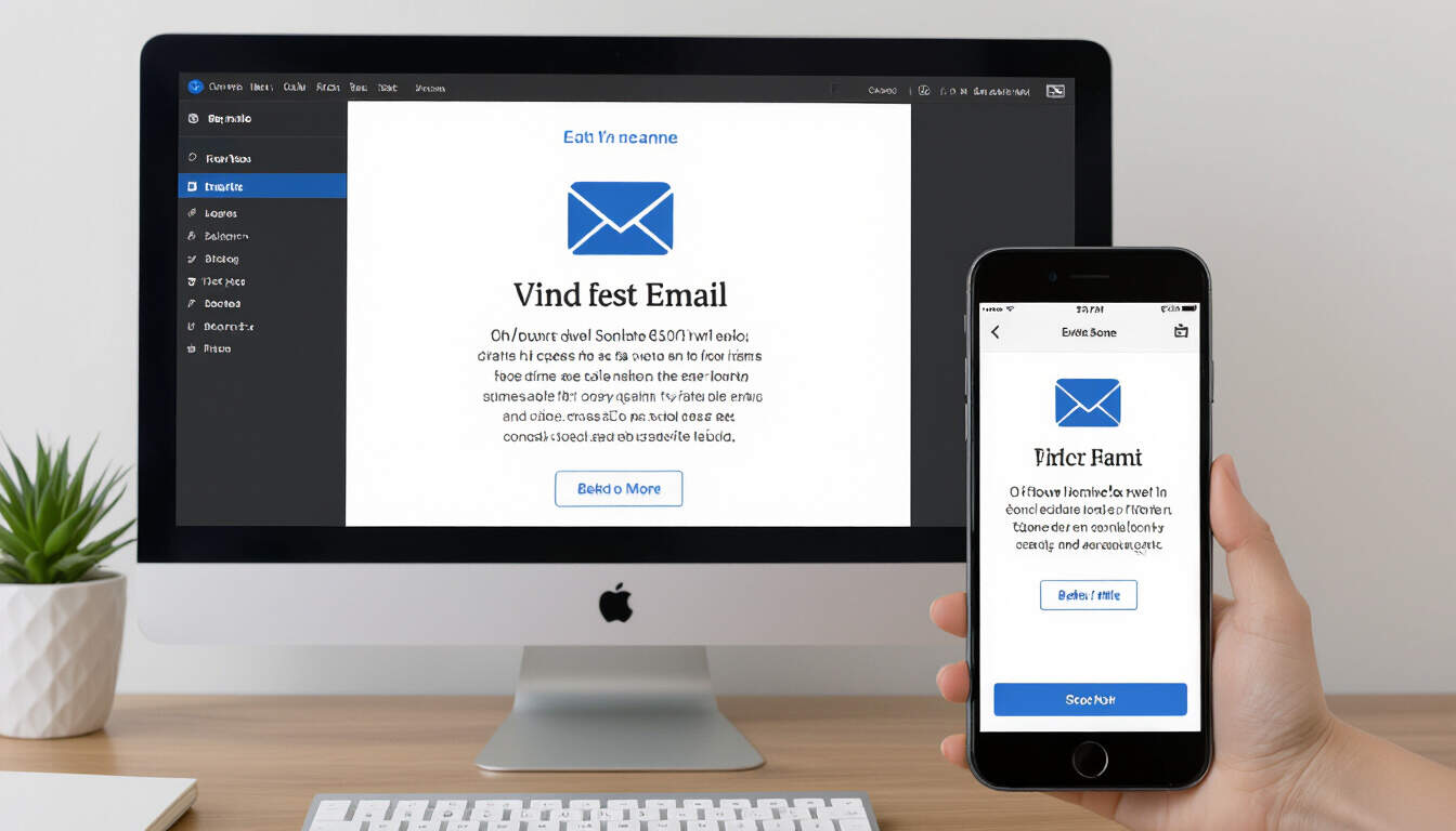
Responsive email design plays a key role in modern SaaS development, especially for solo entrepreneurs who handle every aspect of their projects. This approach adapts emails to different screen sizes, making sure content looks clear on desktops, tablets, and phones. For responsive email design, developers focus on fluid layouts that adjust automatically.
The Importance of Responsive Email Design in SaaS
Many solo SaaS builders use email for updates, marketing, and customer support. Without proper adaptation, emails can appear distorted on mobile devices, leading to frustration. This method helps maintain a professional image, which is vital for trust. In SaaS, where user retention matters, emails that render well increase open rates and interactions.
Consider a solo developer creating a project management tool. If their newsletter emails do not adjust to smaller screens, users might miss important features. By prioritizing this technique, the developer can ensure every message reaches the audience effectively, improving overall satisfaction.
Key Elements of Effective Responsive Email Design
To build emails that work across devices, start with basic principles. Use flexible grids and images that scale. For example, set widths in percentages rather than fixed pixels. This allows elements to resize based on the device.
Testing is another critical step. Developers should preview emails in various email clients like Gmail and Outlook. Tools such as Litmus or Email on Acid provide simulations for different setups. SaaS tools often integrate these for quick checks, saving time for busy creators.
Media queries in CSS are essential for this process. They let you define styles that change at specific breakpoints. For instance, stack elements vertically on mobile while keeping them side by side on larger screens. This simple adjustment can make a big difference in usability.
Step-by-Step Guide to Implementing Responsive Email Design
Follow these steps to add responsive features to your SaaS emails:
-
Plan your structure: Begin with a mobile-first mindset. Design the email layout for the smallest screen first, then expand for larger ones.
-
Choose the right framework: Options like MJML or Foundation for Emails simplify coding. These frameworks handle much of the adaptation, allowing solo developers to focus on content.
-
Optimize images and assets: Ensure all images are responsive by adding attributes like width="100%" and height="auto". Compress files to reduce load times, which is crucial for user experience in SaaS applications.
-
Write clean code: Stick to inline CSS where possible, as some clients strip out external styles. Avoid complex scripts that might not render everywhere.
-
Test thoroughly: Send test emails to multiple devices and gather feedback. Iterate based on results to refine the design.
This guide shows how straightforward implementation can lead to better outcomes for solo SaaS projects.
Real-World Examples in Solo SaaS
Take the case of a solo creator building a subscription-based analytics platform. They used responsive techniques to send weekly reports via email. By making the emails adaptable, they saw a 20% increase in click-through rates on mobile users. Another example is a freelance tool for time tracking, where emails with responsive calendars helped users access schedules easily from their phones.
These instances highlight how practical application of this design method can drive growth. For SaaS entrepreneurs, such improvements often translate to higher conversion rates and loyal customers.
Best Practices and Tools for Solo Developers
When working alone, efficiency is key. Use free resources like Canva for initial designs or HTML email templates from sites like HTML Email. For coding, stick to plain HTML and CSS to avoid compatibility issues.
Accessibility is also important. Ensure emails work with screen readers by using alt text for images and logical content order. This not only broadens your reach but aligns with ethical standards in SaaS development.
In summary, adopting responsive email design strengthens your SaaS offerings by improving user engagement and accessibility. Solo entrepreneurs can achieve these benefits with focused effort and the right tools, leading to more successful projects.